A cocktail App For The Modern Adult
Project Overview
Garnish is a cocktail platform designed for the modern adult, ranging from curious beginners to seasoned bartenders, who want a more inspiring and personalised way to explore, create, and share cocktails. This case study explores how research and system-level design built the foundation for a product that goes beyond recipes to support learning, creativity, and community.
Role: UX Researcher & Designer
Timeline: 6 weeks
Tools: Figma, Google Meet, Airtable
Team: A solo passion project to solve a user-centered problem
Research
User Journey Brainstorm
How it all Started
It began with a conversation with a friend where we had shared our own experiences with cocktails, from the perspective of my bartender days and my friend from making cocktails at home. We both had similar opinions as guests attending various events.
I went home and created what I thought the journey to consider was and began my thinking from there, focusing on someone hosting an event.
The insights gained from this exercise highlighted user needs centered around guidance and inspiration, organisation and planning, and education, with pain points including overwhelming options and time management. This exercise was useful but limited due to its focus on event hosting that neglected other user experiences, skill levels and accessibility requirements.
I knew I had to do more research to better understand who my users were and the larger cocktail experience.
Inital Unknowns
- Who is the modern adult, what are they like?
- What are their motivations around cocktails/mixology?
- What solutions or approaches currently exist?
I performed a 4-week research sprint to provide a solid and informed foundation to design from. My methods consisted of 10 user interviews, 3 contextual observations, and a competitive review of 8 cocktail apps.
User Interviews
Lessons from the source
I spoke to several people about their time spent finding recipes, and their cocktail creation process.
Participants: 10 users who have made their own cocktails in the past, recruited through an ad posted in a bar I had previously managed.
Format: 20 min interviews over Google Meet.
Objectives: To understand how modern adults engage with cocktails, and identify frustrations in the digital cocktail experience.
Insights
Users want help filtering and focusing.
“I just want a few good options, not hundreds.”
Users struggle to build real skill.
“I can follow a recipe, but I’m not improving.”
Users share creations for validation.
“If I make something beautiful, I want people to see it.”
Additional insights found were:
- User types ranged from occasional enthusiasts to regular mixologists
- Users want to discover/explore, experiment/create, share/collaborate.
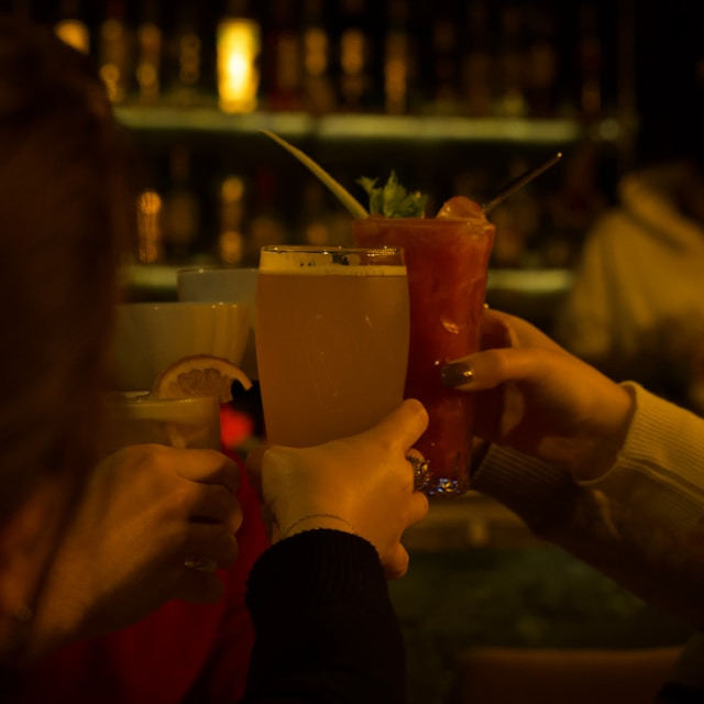
Contextual Observations
Drinkers in the Wild
I observed people in physical and digital environments to discover what they did when enjoying cocktails as hosts and guests:
Participants: 3 friends who like to make cocktails and enjoy social drinking with others.
Format: Documented observations in a particular environment.
Objectives: To explore the experiences of people drinking in various contexts.
Insights
%201.jpg)
- Prefer a well-organised home bar with essential tools easily accessible.
- Often personalise their home bar space with unique glassware and decorative elements.
- Tend to arrange ingredients based on frequency of use.
- Created cocktails based on a skill level deriving from their prior knowledge of cocktails.
- Prioritise visually appealing cocktails with creative presentations and garnishes.
- Actively engage with friends, sharing experiences and seeking recommendations.
- Diverse drink preferences that can change from one event to the next.
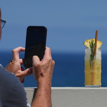
- Actively share their cocktail creations on social media platforms via images and videos.
- Seek recognition and validation from peers for their mixology skills.
- Often follow and engage with mixology trends.
- Explore articles related to various drink topics.
Competitive Analysis
The best apps out there
Comparing 8 cocktail apps, I analysed how each performed in particular categories, giving an overall rating out of 10.
Factors: UX/UI, Features & Functionality, Recipe Database, Search & Filtering Options, Ingredient Information, Personalisation, Community & Socialisation and Educational Content.
Objectives: To discover what made these apps successful, and to find any missed opportunities for innovation and improvement.
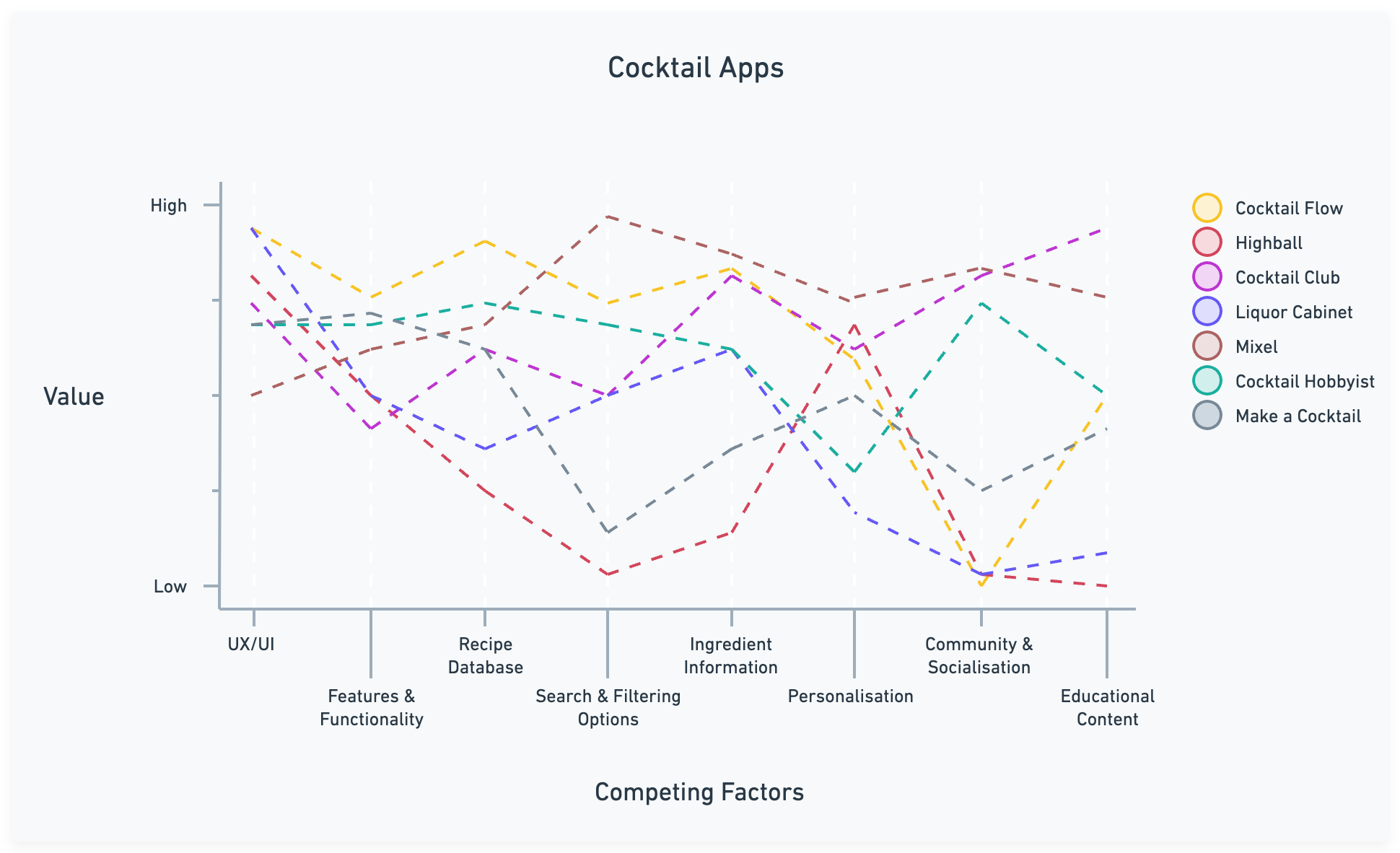
Insights
A clean and visually appealing interface is essential.
To allow for exploration through related content.
Personalisation provides practical and emotional benefits.
There were minimal inclusive search features and cocktail groupings.
Most had a lack of educational content and informative topics on mixology.
Nearly all had no video content.
Research Conclusion
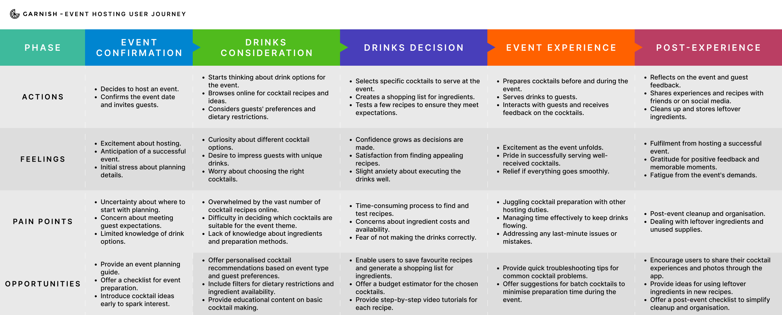
The New User Journey
I revised the user journey I had initially created to represent the newly understood journey that users cycled through. Users could go back and forth between these stages depending on the occasion and skill level, and would utilise this platform to aid them throughout their journey.
Users search and filter results to find specific recipes or browse through curated collections. This phase focuses on inspiring users with new ideas and helping them find the perfect drinks for any occasion.
Users create their own unique cocktails or put a twist on classic recipes. This phase encourages users to experiment with new combinations and techniques, fostering a sense of innovation and personal expression.
Users deepen their mixology knowledge and skills through exploring existing recipes, reading articles and watching video tutorials and tips. This phase is focused on continuous learning, skill development, and becoming more proficient in the art of cocktail making.
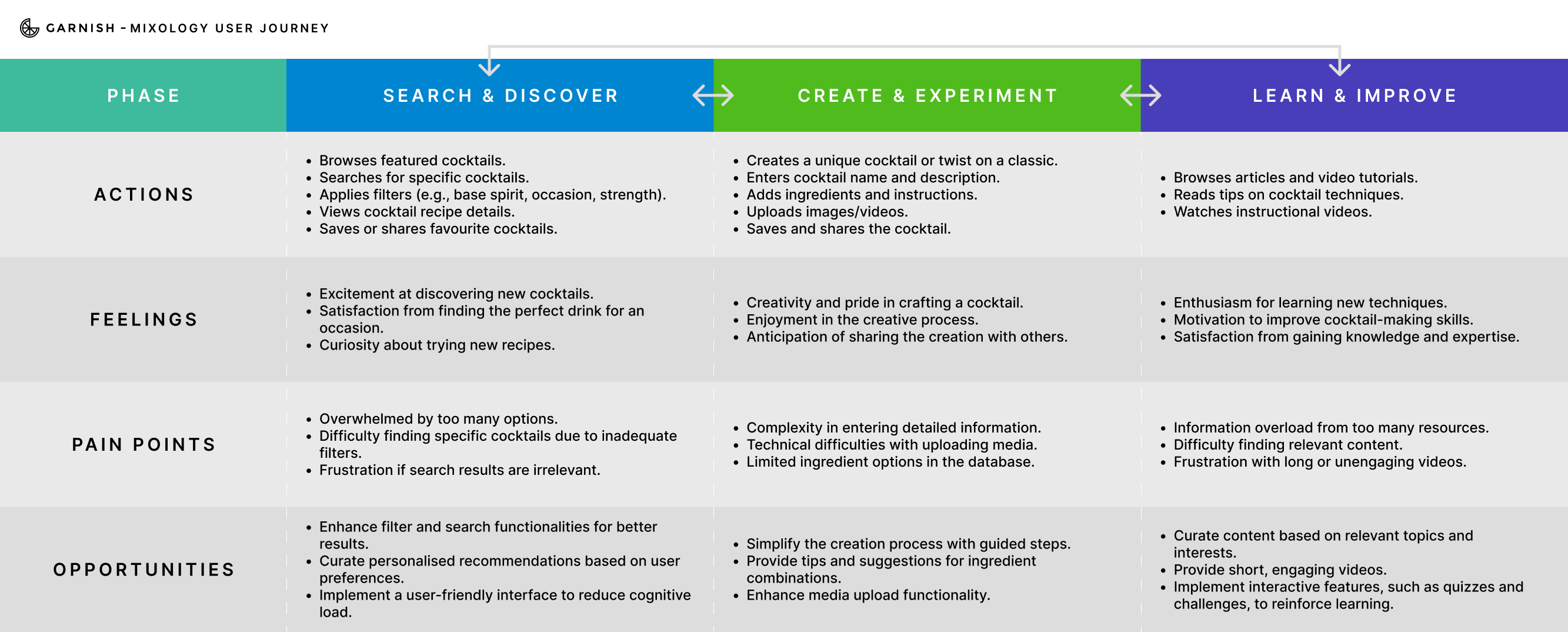
From here I could confidently explore a solution that could serve my users, no matter the occasion or level of cocktail experience.
Design
After analysing the results of the research, I defined my goal to encapsulate what I wanted to achieve overall:
I'm designing a platform that provides the modern adult with an inspiring array of cocktail recipes that can be made at any skill level, and a community of cocktail enthusiasts.
With a goal clearly established, I moved on to creating a solution.
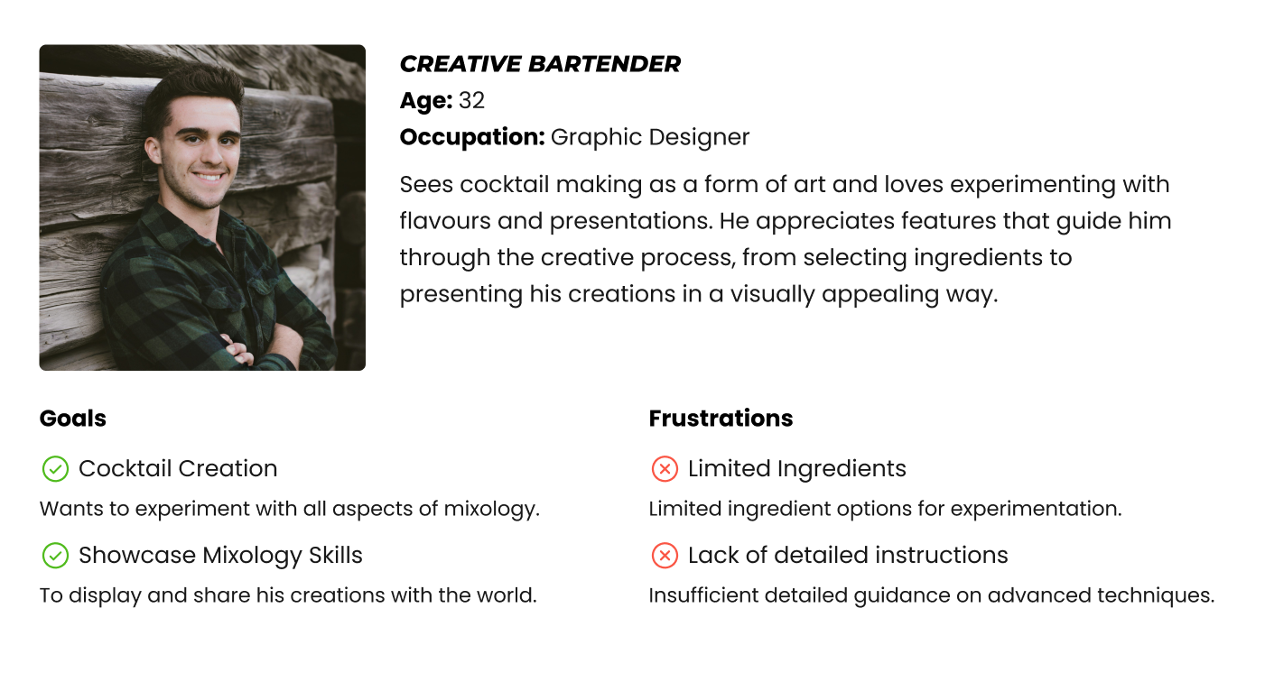
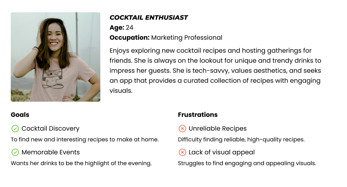
User Personas
My target audience
I created two personas to represent the range of users I was designing for, highlighting the some common goals and pain points discovered previously.
I employed OOUX to define my system through a thorough exploration of the objects most commonly associated with cocktails. This was to ensure the system aligned with its user's mental models, creating an intuitive and engaging user experience.
The ORCA process explores objects, their relationships, calls-to-actions and attributes through iterative rounds of user-centered thinking, that translate research and requirements into justified and clarified design.
Object-Oriented UX
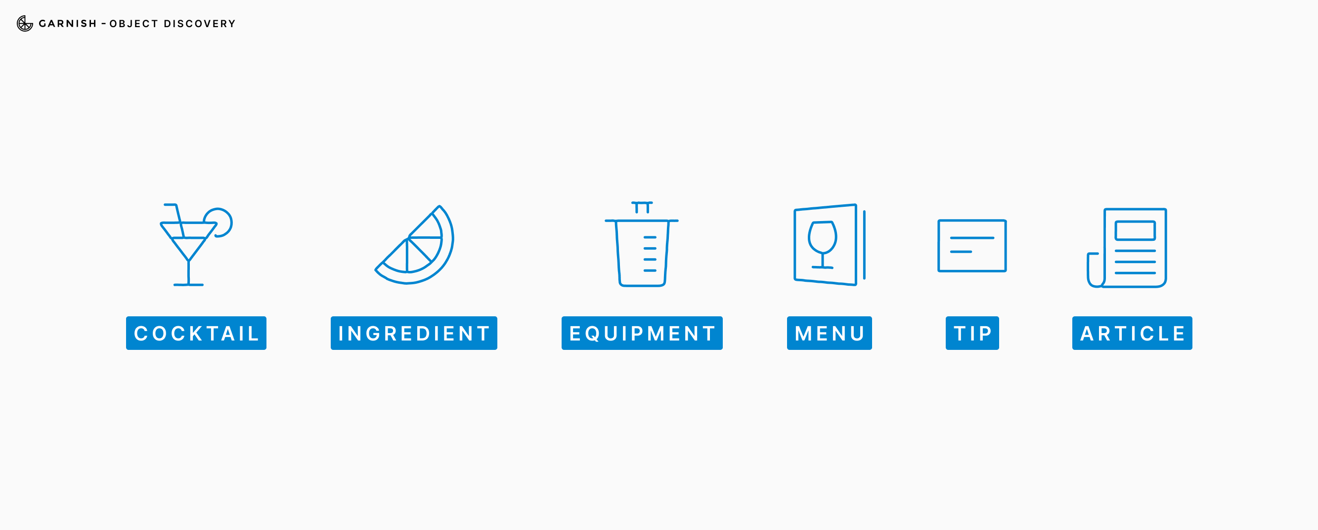
Object Discovery
My research uncovered a consistent set of concepts users associated with the cocktail experience like cocktails, ingredients, equipment and menus. Users had also mentioned bite-sized and longer forms of information sources that they had found as useful references. These terms were consolidated into core objects that reflected how users naturally think and talk about making and sharing cocktails.
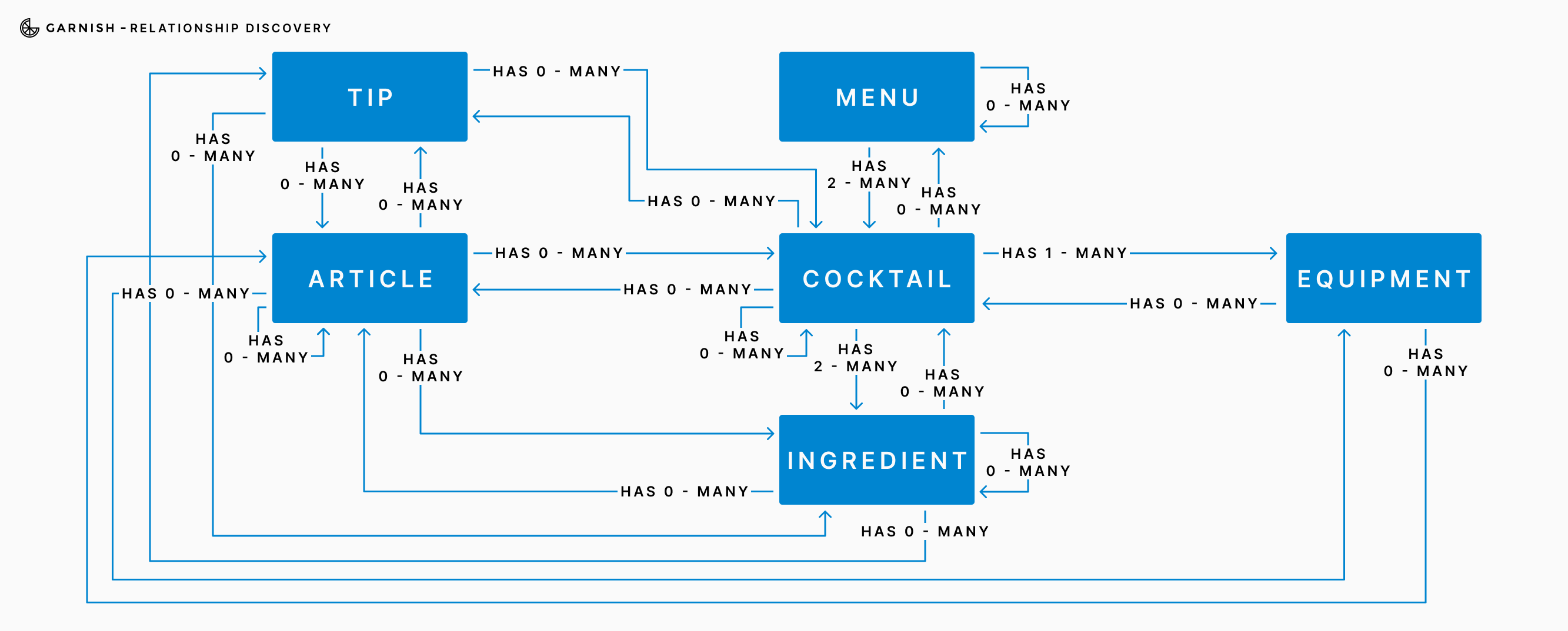
Mapping the relationships between these objects revealed exactly how they were connected, and gave me a glimpse at how this system could be developed further. By defining the actions users take on each object and identifying their associated attributes, I built a clear foundation and could confidently move on to exploring this system in more depth.
Defining Requirements
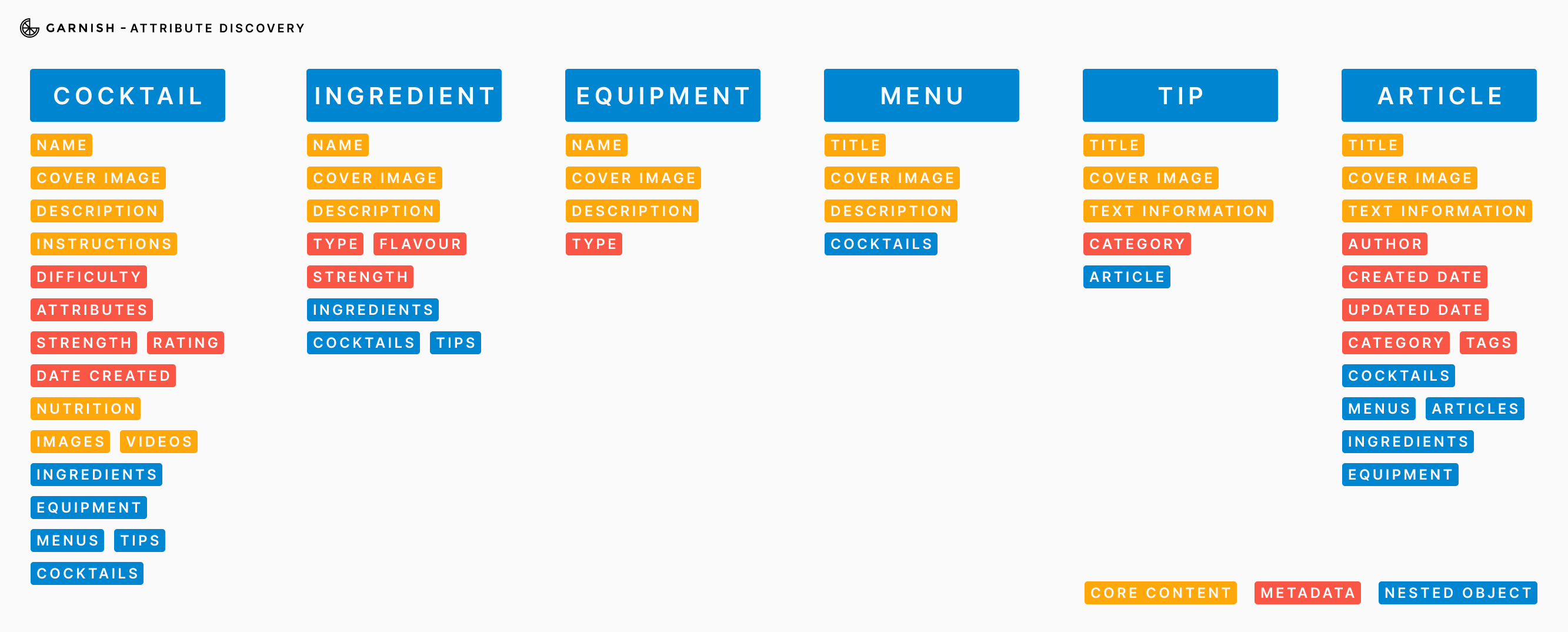
My next step was to deepen the system logic by clarifying how each object functions within the user experience. Using Airtable, I developed an object guide to define the role and purpose of each object, along with ownership, success metrics, and examples to ensure clarity and consistency across the system.
This deeper exploration revealed gaps in my initial discovery sessions. For instance, while 'cocktail' and 'ingredient' were core from the outset, I identified the need to introduce 'recipe' and 'step' as distinct objects, as they were critical for supporting varying skill levels and multimedia instructions.
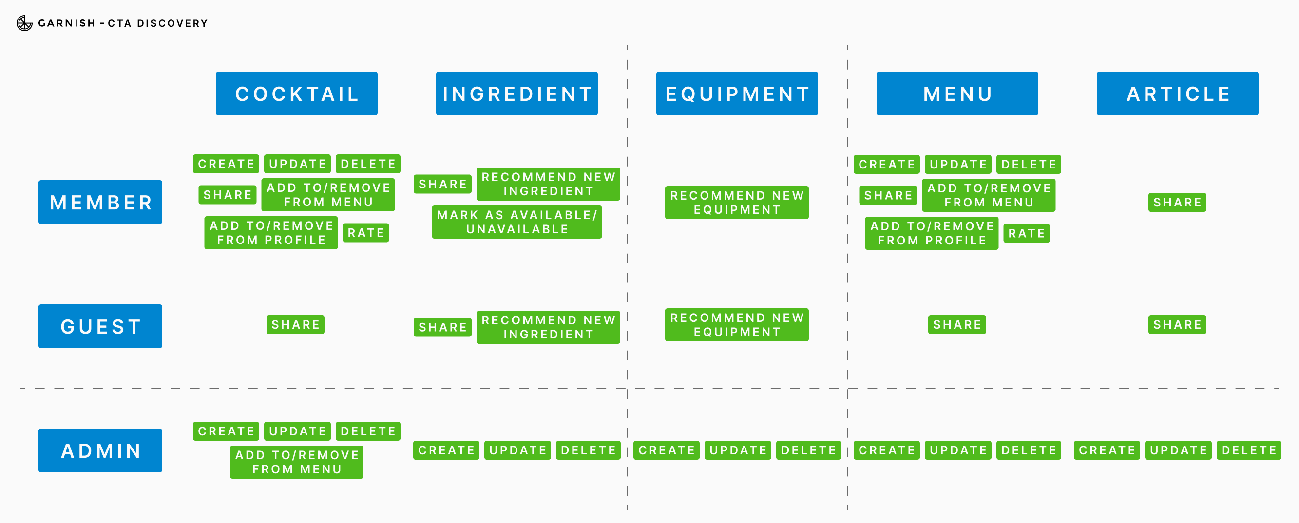
I expanded the CTA matrix to better understand user motivations, mapping specific actions (like saving, rating, or sharing) to the right context and scope within the system. I then defined object attributes with a focus on metadata, user permissions, privacy, and conditional logic to establish a solid foundation for both user experience and system scalability.
prioritising for Impact
To define the MVP and guide future development, I revisited the object structure, relationships, user actions, and attributes through the lens of user value and implementation effort. This helped segment the system into two distinct phases based on what would deliver the highest impact early.
The first release focuses on the core functionality of helping users discover, search for, and create cocktails and menus. It includes a curated content experience supported by educational articles and tips, designed to inspire confidence and creativity from the start.
The second phase introduces advanced features like user ratings, multimedia instructions, and gamified elements. These additions aim to reward continued interaction, support skill progression, and encourage social sharing to build a more connected and motivated user base over time.
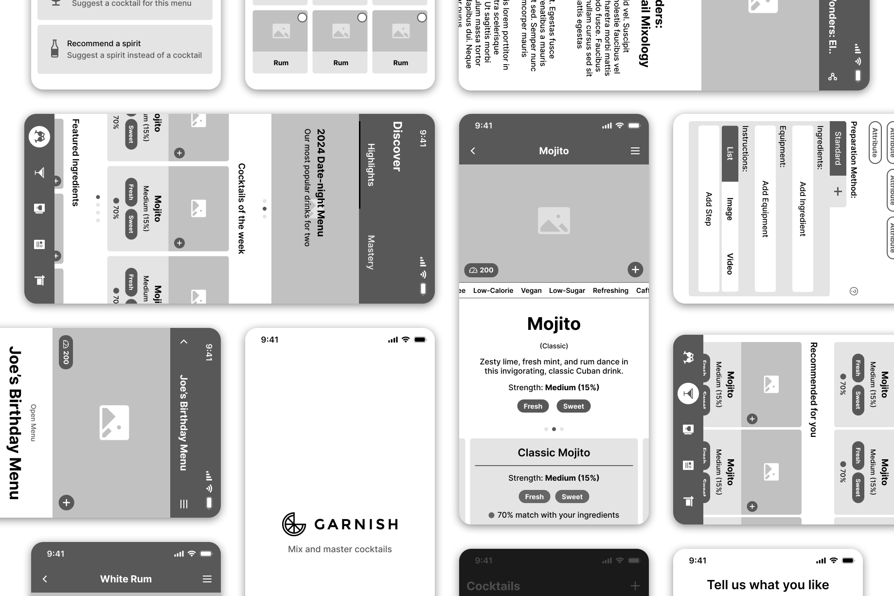
Visualising The System And Objects
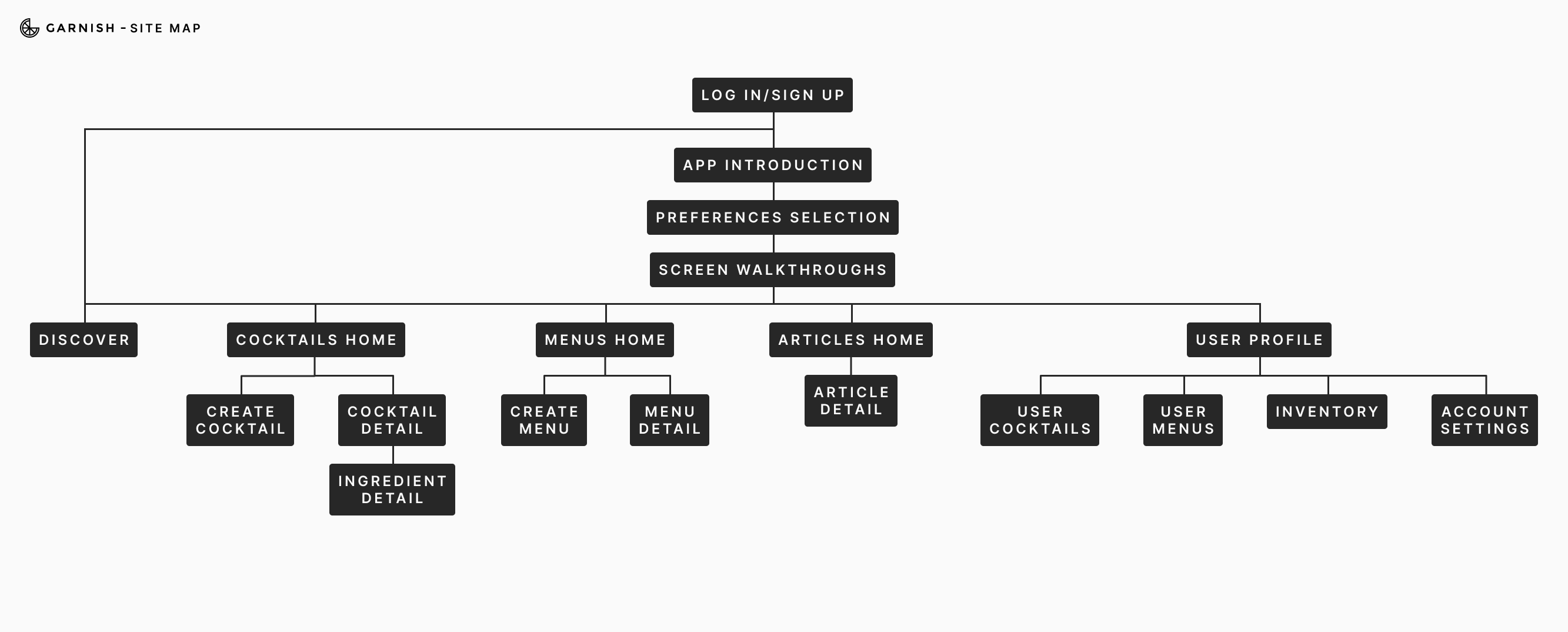
With a focused feature set defined, I began shaping the user experience by illustrating the system. I created a navigation flow to visualise how users would move between key objects, and how groups of object instances could be organised. This was followed by a site map covering all primary screens for Phase 1, providing a bird’s-eye view of the platform. These artefacts guided the layout and hierarchy of the interface.
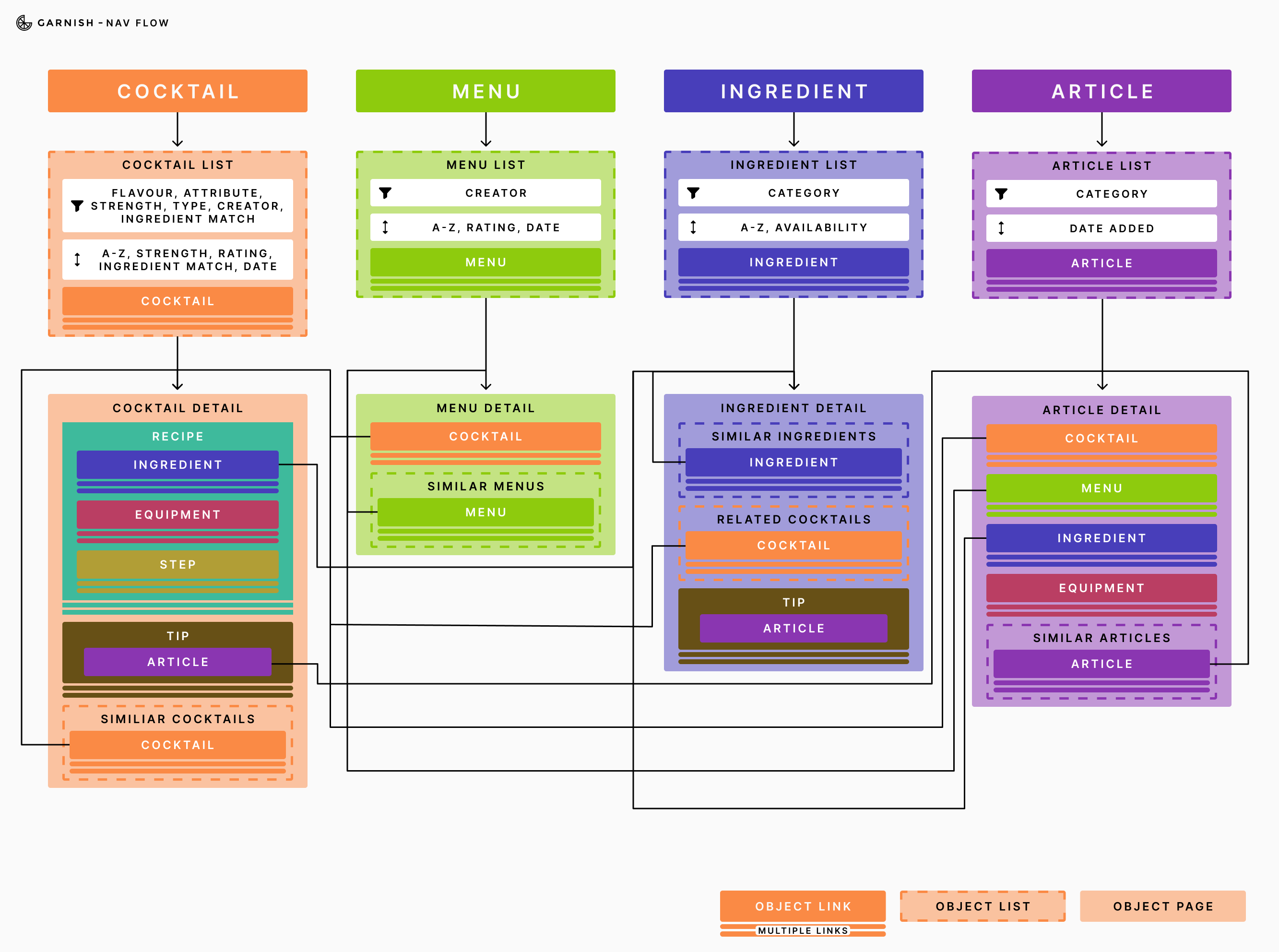
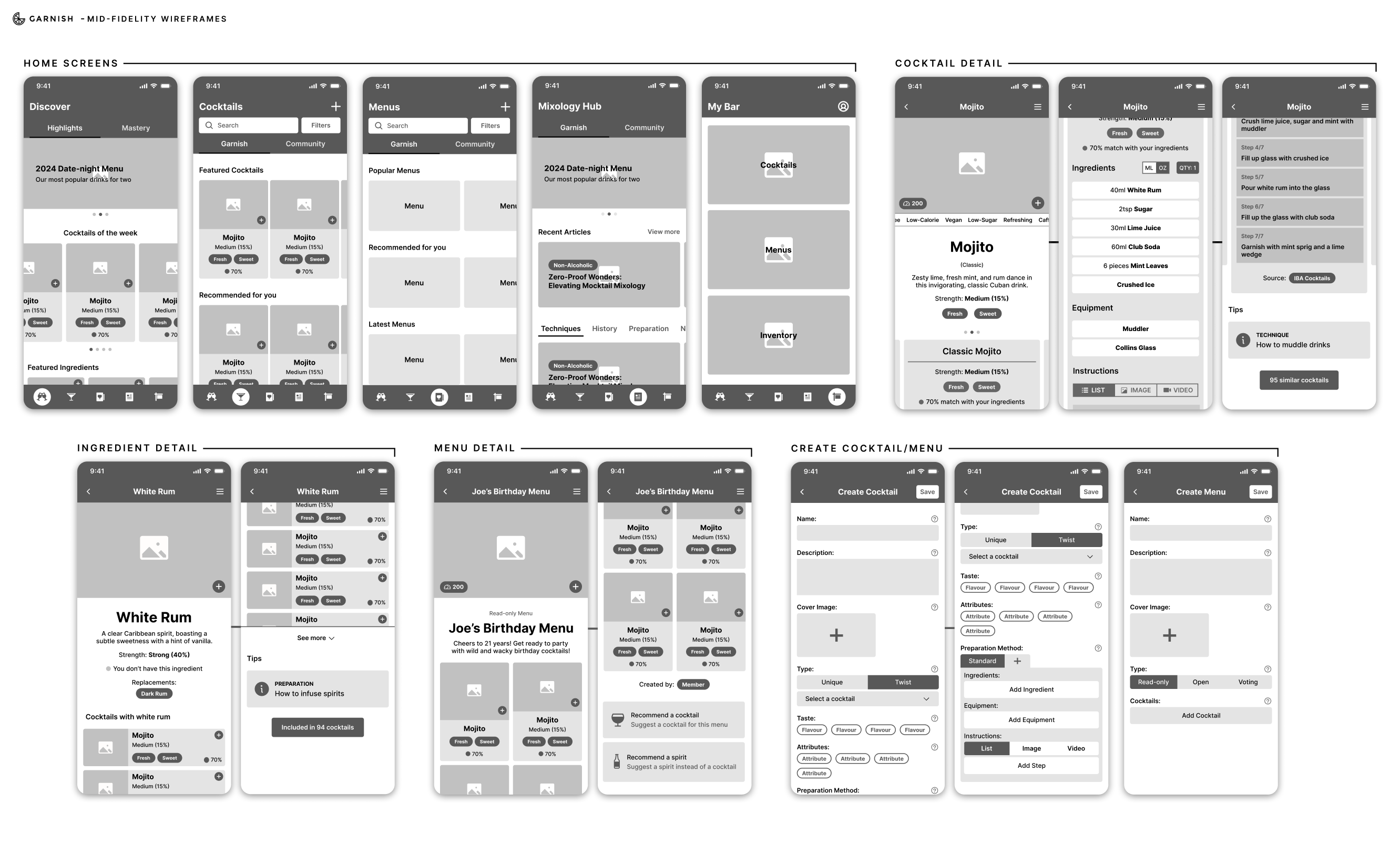
To continue this process, I designed mid-fidelity wireframes that represented key object views (such as cocktail cards, lists, and detail pages). These were assembled into a clickable Figma prototype to be tested and validated.
Design Conclusion
Introducing the Garnish app
The final design for Garnish reflects a holistic approach to the modern cocktail experience, one that supports users across different skill levels, occasions, and motivations. Informed by research and grounded in user-centered structure, this proposed system provides results, creativity, and connection for its users.
Garnish tailors search results and recommendations based on the user’s saved preferences and available ingredients, reducing decision fatigue and ensuring every suggestion feels relevant and achievable.
Users can group cocktails by any context and can create several types of menus: read-only, open, or voting. This offers both control and engagement, giving hosts new ways to involve guests in the planning process.
Users deepen their knowledge and skills through reading articles and watching video tutorials and tips. The focus is on continuous learning, skill development, and becoming more proficient in the art of cocktail making.
Browse, save, and learn from creations shared by others. This fosters inspiration, connection, and validation, and creates a living, evolving library of cocktails and recipes.
Together, these features create a system that’s not just about mixing drinks, but about empowering users to explore, learn, and connect, on their own terms and at their own pace.
Test
To validate the usability and structure of Garnish, I conducted click-through testing using the mid-fidelity Figma prototype. The goal was to assess whether users could navigate key flows, understand core features, and feel confident using the system, even without full functionality in place.
I tested with 5 participants representing a mix of home cocktail enthusiasts and casual users. Each was given realistic tasks, such as building creating a cocktail and menu, searching for a recipe using available ingredients, and exploring educational content.
Most users navigated the prototype with ease and appreciated the clean layout and object structure. Some hesitancy was noted around understanding the menu modes (read-only vs. open vs. voting), suggesting an opportunity for clearer UI labels or onboarding support.
While the prototype lacked live functionality, this test successfully identified areas for refinement in feature communication and flow logic. A future interactive prototype or coded MVP would be the next step in testing dynamic features like personalisation and sharing.